Most of the developers like dark mode. But creating a dark mode for a site is ... hard. But wait! I have a solution for you. This is only less than 20 lines of CSS! so let's begin.
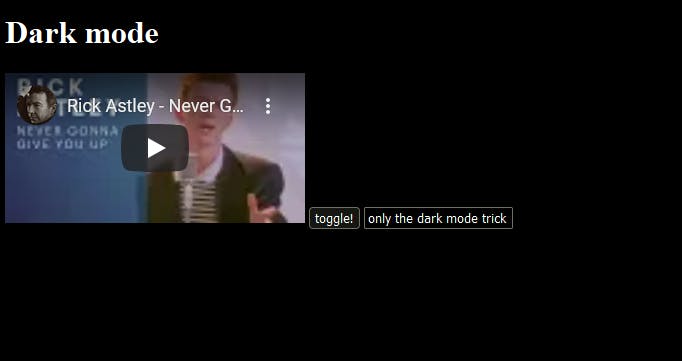
Show me a preview first.
Okay if you don't believe it, check this codepen I made just for you.
Nice isn't it? So let's get started.
The trick!
We first make an :after pseudo-element of the Html element like this. And of course, we add it only for the dark mode.
html.dark:after { content: ""; /** won't create element if we don't use this **/ }
Now we make the element be the same height and width as the screen.
width: 100vw;
height: 100vh;
position: fixed;
top: 0;
left: 0;
Now here's the best part.
background: white;
mix-blend-mode: difference;
And we're done!

Uh. Oh wait I forgot, we must add a background to the body to work.
html.dark {
   background: white;
}

You can change the body background darkness easily by changing the colors o light values.
#e4e4e4 -> Somewhat dark but easy to your eyes
And finally, add this so your images don't get wasted!
html.dark iframe,
html.dark img,
html.dark svg,
html.dark embed {
   mix-blend-mode: difference;
}
And that's all for the post now. Here's the full code.
html.dark:after {
    width: 100vw;
    height: 100vh;
    position: fixed;
    top: 0;
    left: 0;
    background: white;
    mix-blend-mode: difference;
    content: "";
    pointer-events: none;
}

html.dark iframe,
html.dark img,
html.dark svg,
html.dark embed {
    mix-blend-mode: difference;
}

html.dark {
    background: white;
}

